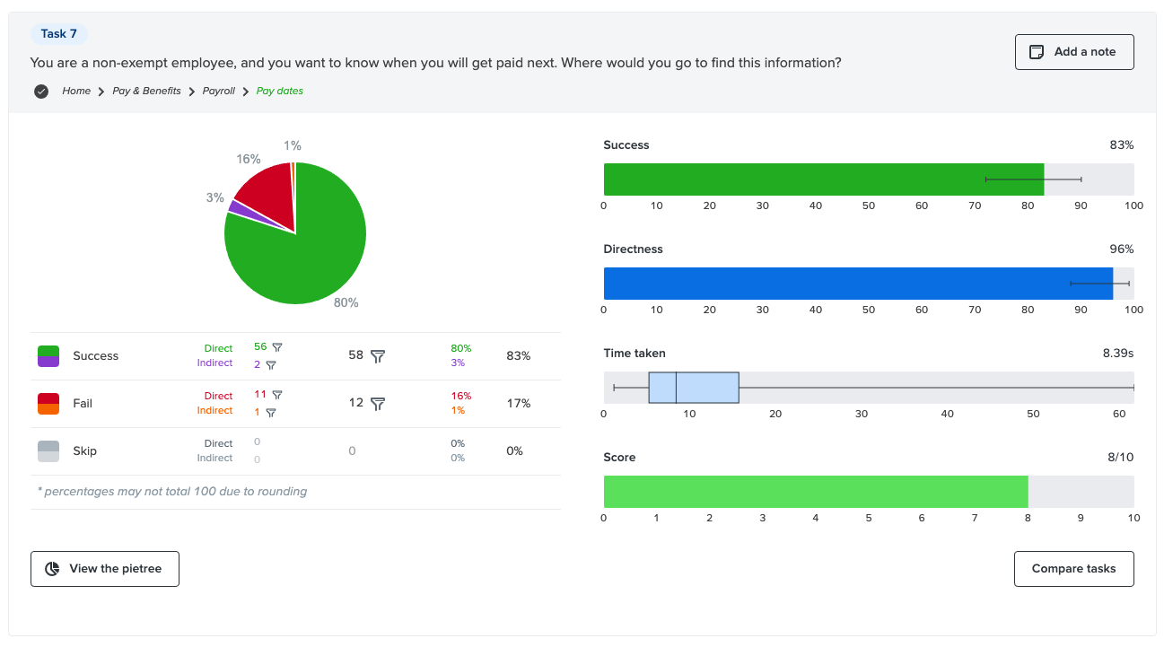
Case Study
Human Resources
Realignment and reorganization of the University of Missouri
Human Resources website
University of Missouri, 2020-present
Role: UX designer
Background
University of Missouri Human Resources underwent a reorganization and realignment, resulting in the merging of MU campus and UM System-level services into one cohesive service unit. Our team was tasked with:
Creating a new site that pulls together HR content housed on multiple websites and enterprise applications across several domains.
Streamlining content to make it easier for subject matter experts to manage.
Improve the experience for employees, particularly new employees.
Team
UX designer (me)
Writers (2)
Human resources subject matter experts
Front-end developer
Drupal site builder
Project manager
Skills used
Content auditing
Interviewing and surveys
Information architecture
Tree testing
Interface design (mock-ups/prototypes)
Presenting
Step 1 — Discovery
I led the discovery phase of the project where we:
Identified three major user groups and their needs and frustrations

Three user groups: Job seekers, general employees and HR specialists/consultants
Conducted a content audit using an scorecard I developed as a campus resource
This activity helped our HR subject matter experts determine which content could be archived and which would need to be revised or added. This process also helped us identify a large amount of content that was repeated under audience categories (e.g., managers and employees both needed access to the same content), creating confusion for both our HR staff members and — we expected — university employees.

Asked HR staff, department HR consultants and university employees (site users) questions about the site
This included a questionnaire to stakeholders and expert site users, asking front-line HR staff to tell us what questions they frequently get from employees who call or email the office, and talking with people on our team (not assigned to the project) about their experiences with the site as employees.
[Note: Ideally, I would have interviewed a larger group of site users, but the small group I did interview included employees with between 22 and 0 years of service.]
Examples of feedback we received
“I was looking for information about maternity leave and couldn’t find it. The site is confusing.”
—Employee
“I struggle to locate support documents – I think sometimes they appear on the far lower right corner of the page and it is not intuitive that I need to scroll down there to get to those documents.”
—HR staff member
“Documents are saved multiple times in multiple places.”
—Departmental HR consultant
Reviewed Google Analytics data
I analyzed search terms entered into the site search for the past year. People often resort to search when they are unable to find information while browsing. Search terms entered could give us some insights into what content is difficult to find and allow us to spot any discrepancies in how our end-users think about a topic verses how our HR subject matter specialists refer to the same topic.
People expected to be able to find job postings through the site search, but job postings are located on the enterprise HR application site (do not appear in site search).
A sizeable number of people use the website to access enterprise HR applications.
Payroll, timesheets, leave policies, tax forms and new employee orientation received the most visits.
Step 2 — Information design and validation
Next, I used the information and insights from the discovery phase of the project to develop a content strategy and information architecture plan that included the following:
Culture-oriented content for employees with more nurturing, helpful tone.
Prioritized content for general employees based on what we know about their needs, frequently asked questions
Grouped content for expert-level subject matter experts, HR consultants and departmental HR processors into a section for them. Move out of main employee-facing area.
Came up with new organization sitemap that balanced the needs of novice employees with those of HR staff and processors who need detailed information about processing personnel actions.

New sitemap created in Slickplan
I then conducted a tree test with 110 users in our target user groups to verify that the new architecture made sense to them. The tree test turned up a few areas that caused confusion, so I revised the sitemap to address those issues and noted others that could be addressed by our writers in the page content. After some additional negotiation with the HR team and subject matter experts, I received sign-off on the site map and approval to move on to the mock-ups.
Example of tree test results using Optimal Workshop’s TreeJack test
Road bump
Leadership changes and reorganization happened halfway through project resulting in shift in priorities.
“Thank you for being so patient with my questions today. I’m trying to get up-to-speed quickly. This is such an important part of establishing the new vision of HR and how we can more fully support the missions of the University. We are making good progress and appreciate all your support.”
— New HR executive
Step 3 — Interface design
Next, I collaborated with our content team to create mock-ups (rough prototypes) in Adobe XD. After several iterations, I wrote up design specs for our developers and met with them to hand over the project for development.
Before redesign
BELOW | The navigation is a mix of audience categories (e.g., Managers and Employees) and information types (e.g., Policies, Guides, Training, etc.). The policies were separate from the guides (“how to” information), and there was significant overlap between the managers and employees content. The site is structured in a way that prioritizes HR staff over employees.

Homepage (desktop)

Homepage (mobile)
After redesign
The new site architecture is based on topics that are important to job seekers and general employees.
Policies and how-to content related to each section topic can be found within the section. I left a direct link to the policies index in the utility navigation at the top of the site for easy access.
The new Departmental Processing category in the utility menu houses all the HR processing information for HR staff and departmental representatives.
A prominent link to MU’s enterprise self-service app, myHR, appears in the primary site navigation because we know employees frequently look for that link on the site.
Employees can now easily make name changes, beneficiary changes, find about leaves of absence and retire.
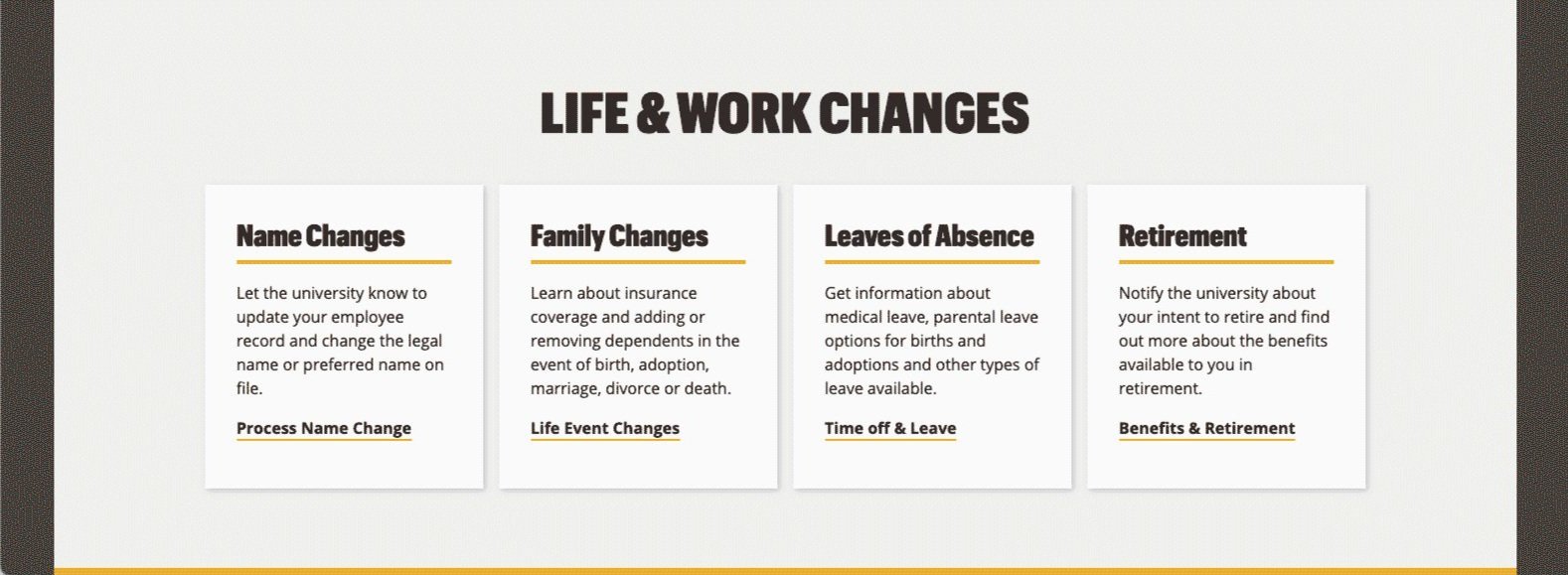
The Departmental Processing section for HR staff contains content needed by that group without confusing general employees.


What I learned
There are a number of things I would do differently given the budget and staff resource restrictions for this project.
Conduct a heuristic evaluation of the website at the outset. This may have helped build buy-in with some of our HR colleagues.
Insist on additional short interviews with university employees to learn more about why the visit the HR site.
Try workshop/ co-design activities to help the HR team members build more understanding and empathy for users.