Case Study
Show Me Renewal
Usability testing for the University of Missouri’s pandemic communications website
University of Missouri, October 2020 to February 2021
Role: UX designer consultant
Background
The University of Missouri’s COVID-19 pandemic communications website, Show Me Renewal, quickly grew in size and scope as the editorial team rushed to get information out during the spring and summer of 2020. The editorial team began experiencing difficulties maintaining the site content.
I was not part of the editorial team or initial design team, but I offered to assess the site and see what I could do to help. I needed to get buy-in from the editorial team and our chief marketing officer, showing them the value I could provide to their work. I hoped this would also provide an opening to investigate how our users experienced the site and address the issues I suspected they were running into.
Team
UX designer (me)
Pandemic communications team (4 writers)
Skills used
Usability testing
Information architecture
Presenting
Consulting
Step 1 — Define the problem
I started by speaking with several of the editorial team members to find out more about their biggest pain points. I learned that they were maintaining the same information in at least two places: a large Word document that was converted into a PDF and posted on the website and the website itself.
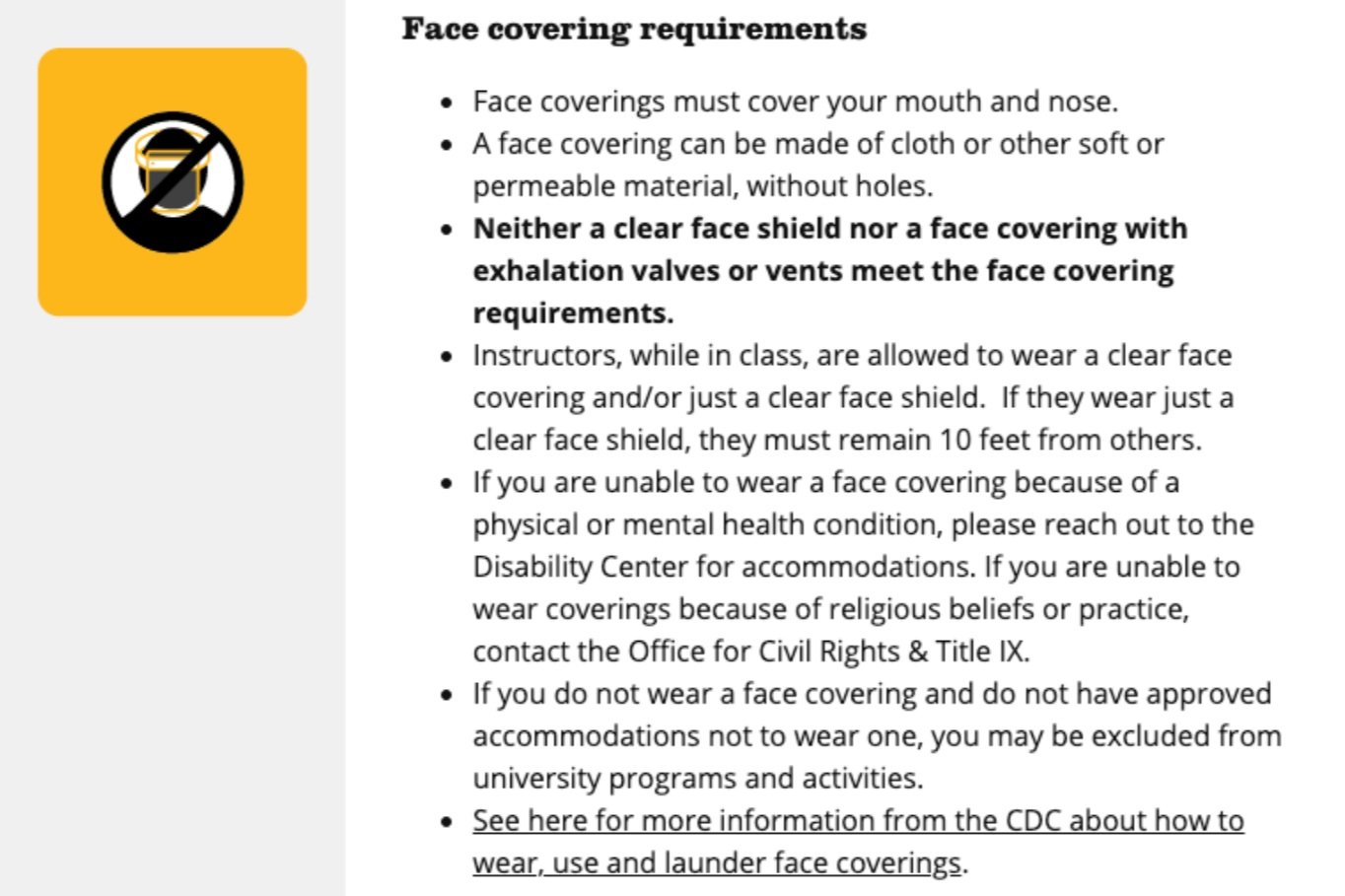
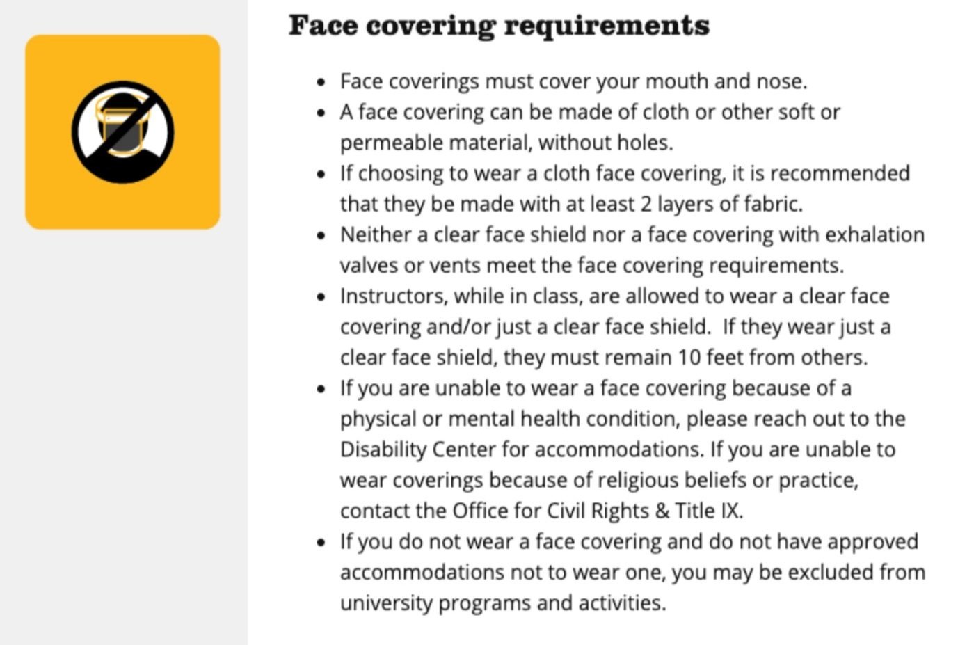
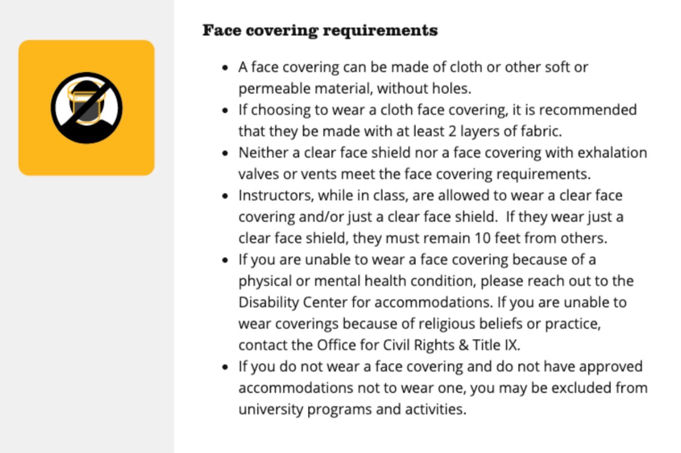
I then did a inventory of the website and identified redundancies and other content issues. I soon discovered that some content such as face covering guidance was repeated as many as six times. When it changed editors had to find and update the copy in six separate places. Not only was this tedious, but editors risked missing an update to one of those areas.
Below | Screen shots of nearly identical face covering content in six different areas of the Show Me Renewal website. I used this example to demonstrate the problem and introduce a solution.
Students page (/students)
Safety and expectations page
Visitors page

Show Me Renewal Plan PDF

Students FAQ page

Students FAQ page
Step 2 — Get buy-in and propose solutions to editorial team’s problems
Once I had defined the scope of the problem, I worked through possible solutions. The site content was split by audience and topic, which lead the editors to duplicate content in each of those sections. They weren’t sure we would get approval to make huge changes to the site, so I came up with a recommendation that would provide some relief to them without completely reworking the site architecture.
My proposed solution would involve moving the detailed content (e.g., face coverings policy) to single pages that could then be linked to from landing-style pages. The landing pages would provide overviews of topics organized into cards. In this way, we could take users from general pages with short blurbs and links to the topic pages with detailed policies and recommendations. This would mean only having to update the topic page in one location.
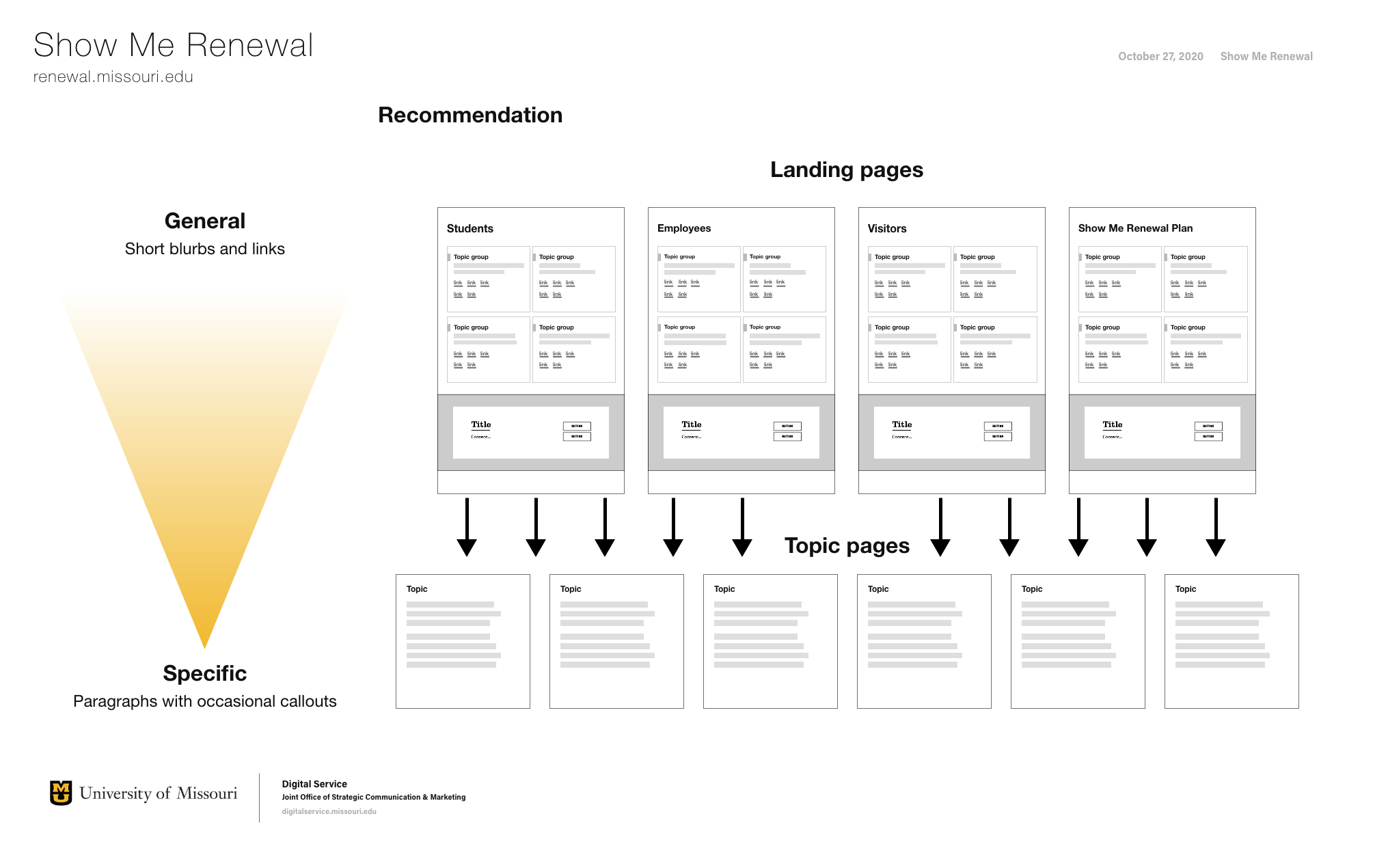
Above | Graphic illustrating my recommendation to the content team
I presented my findings to the editorial team. They were very receptive and gave me permission to make these changes on our development site. Once they reviewed them, we presented them to the chief marketing officer. She approved moving forward with my recommendations and approved usability testing to learn more about how are users experienced the site make sure we were addressing their issues.
Step 3 — Learn how people experience the site
I then worked worked with one of the editorial team members to determine the most important user tasks based on issues they were aware of through their work with the campus emergency management team. We settled on three key scenarios where users would need information on the Show Me Renewal website:
What to do if they feel ill
Whether they need to quarantine if they are exposed to someone who tested positive
What to do if they test positive
I wrote the testing script (PDF) using a “think out loud” protocol and recruited test participants from the campus community by email. From the 220+ invitations sent, ten people agreed to participate: two students and eight employees. Nine of the participants had previously visited the Show Me Renewal site, and one had no experience with it.
The tests, each about 30 minutes long, took place over Zoom and were recorded so that I could do post-interview analysis. Both the participants’ screen and their camera were recorded.
Step 4 — Present usability study findings and recommendations
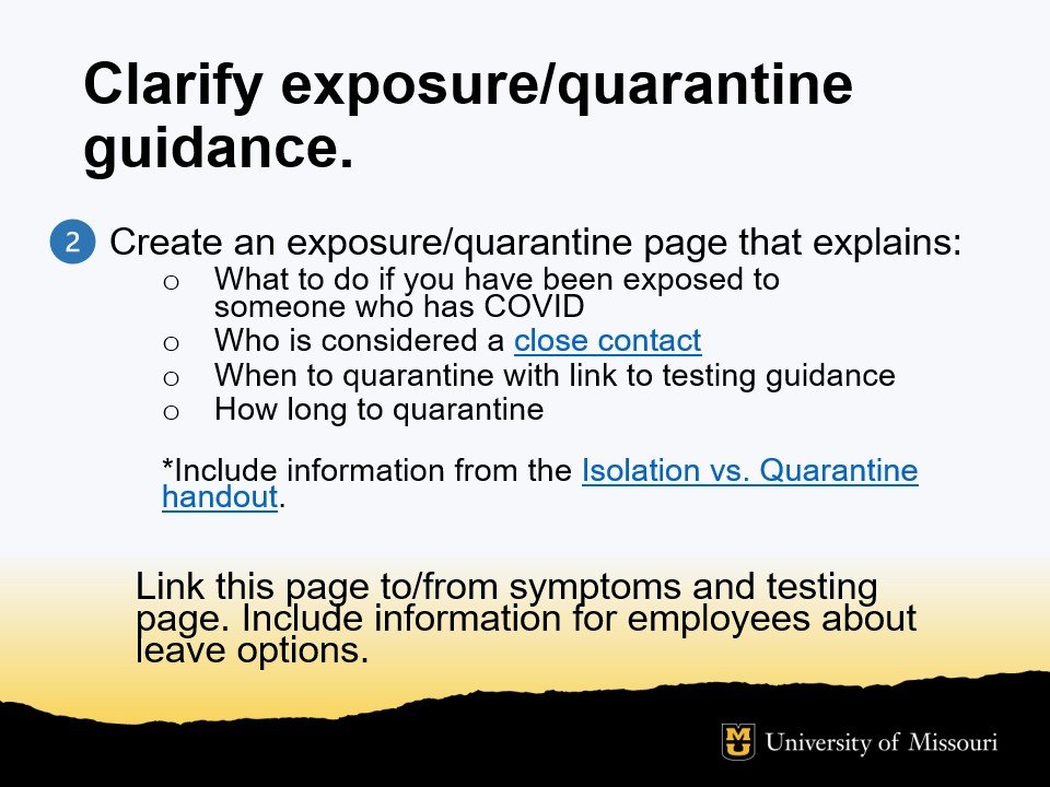
The usability test findings showed that Show Me Renewal website generally did a good job providing information about prevention, testing and post-testing isolation/quarantine. Participants did, however, have difficulty knowing what to do if they were exposed to COVID-19 and when and how they might need to quarantine.
Additionally,
All participants found the link to report a positive case; however employees expected to see a link to a reporting form for them instead of instructions to email their supervisor. Many mistakenly clicked on the student or supervisor form.
Some of our student participants hesitated to click on the “Students” section because they thought it would be too general and didn’t want to sift through a long list of information.
Participants pointed out content gaps that our editors were unaware of — how employees can get paid when required to quarantine; events policies and guidelines for safely using residential hall common areas.
I developed recommendations (summary below) based on the usability test findings and presented the recommendations to the editorial team as a prioritized list. This allowed them to make quick, high-impact changes first, followed by the others as time permitted.


The results
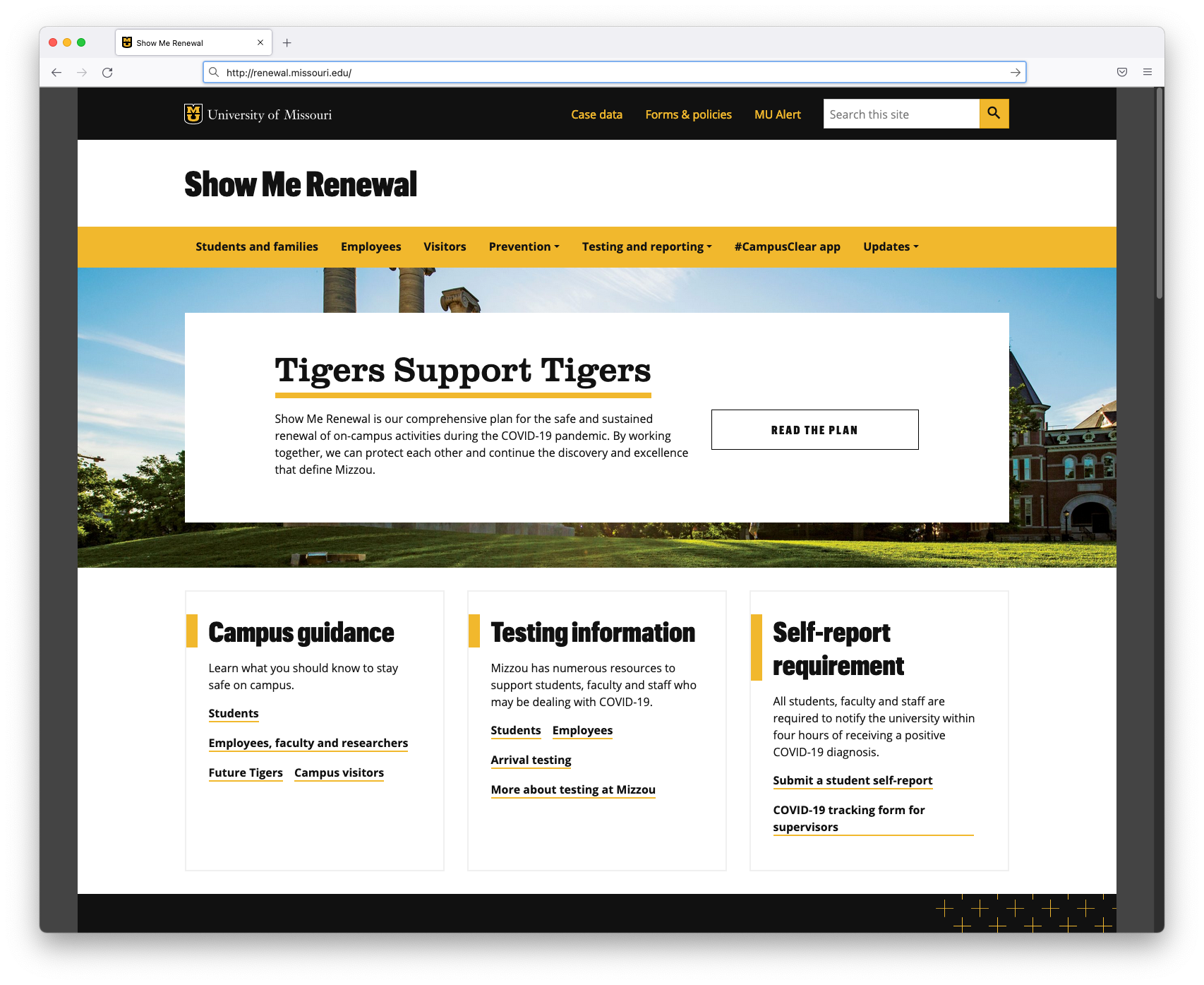
Before
The large banner area shows the vague Tigers Support Tigers headline and a link to “the plan” (a document written from an administrative perspective).
The primary navigation is organized by audience group and topic. Quarantining doesn’t appear in the menu, making it difficult for visitors to know where to find that information.
After
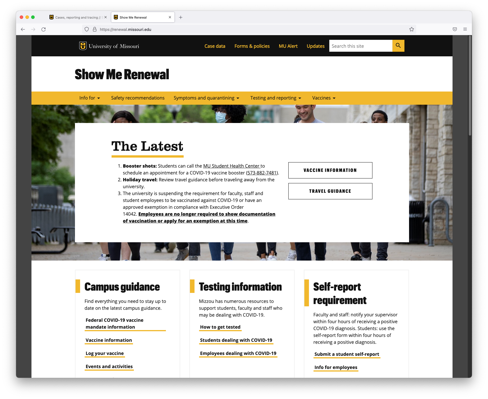
The large banner is now used to highlight information that is more relevant and useful to users such as vaccine information and travel guidance.
Primary navigation categories were revised to align more closely with student and employee information needs: safety recommendations; symptoms and quarantining; texting and reporting; and vaccines.
Before
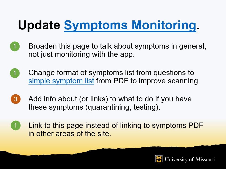
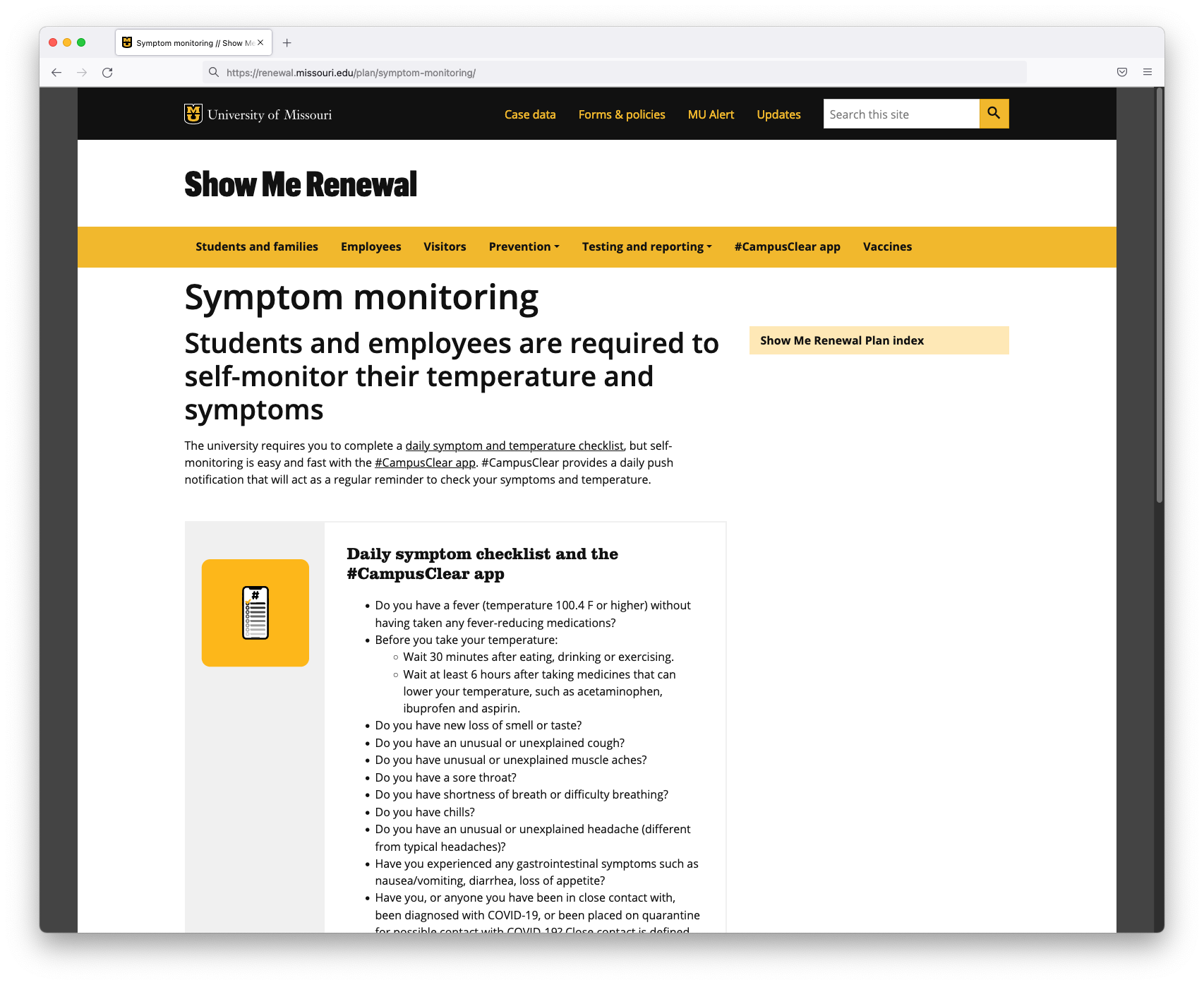
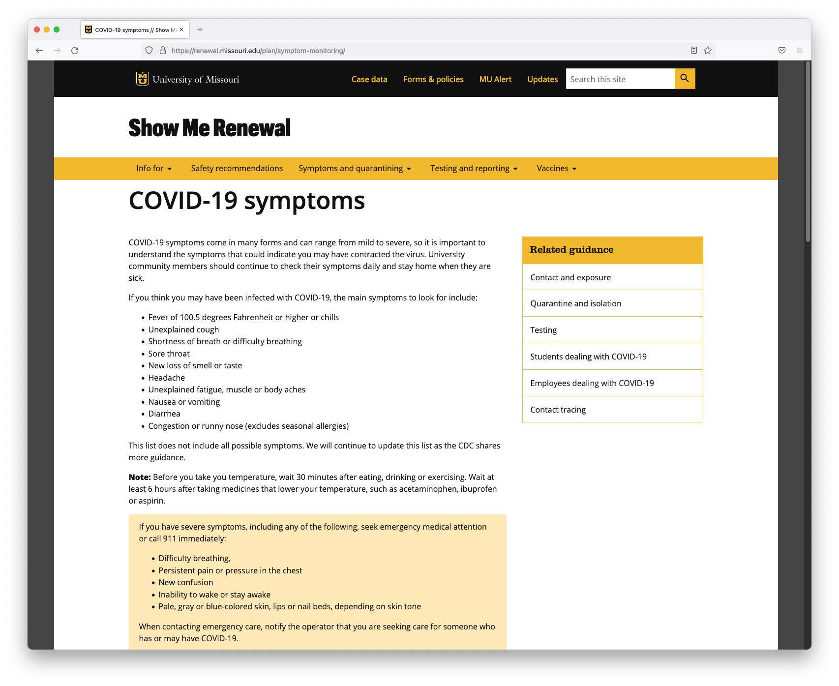
Symptom monitoring page confused some users and didn’t answer questions about what people should do if they had these symptoms.
After
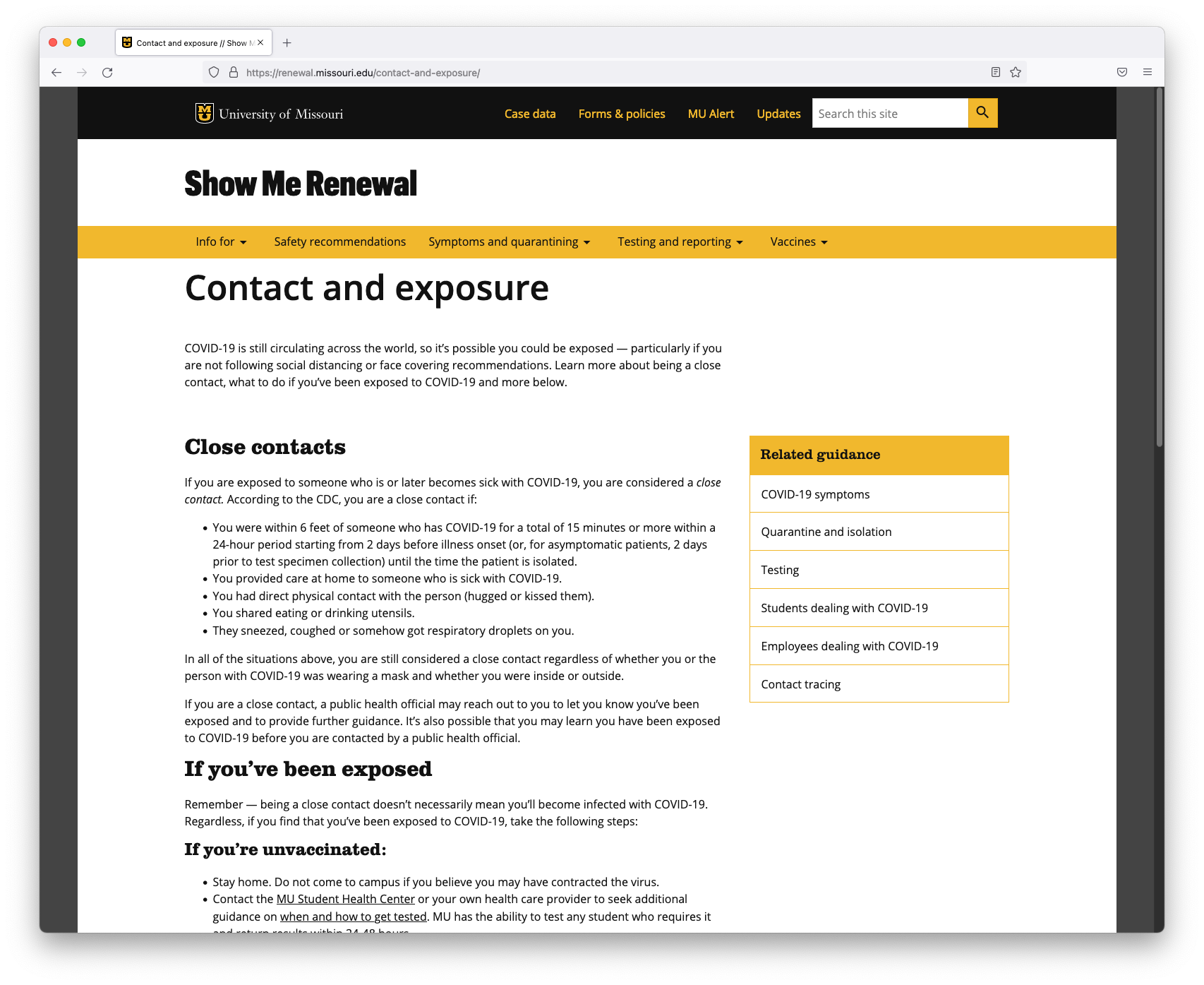
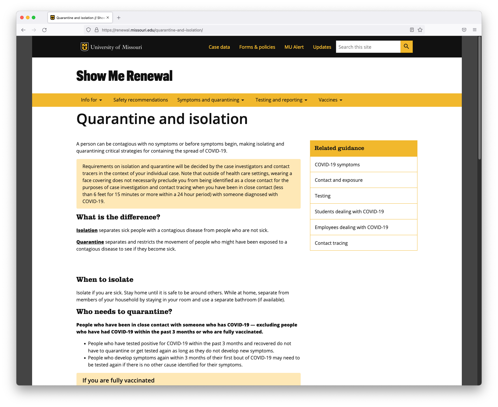
Symptoms monitoring just becomes COVID-19 symptoms. Links to contact and exposure, and quarantine and isolation pages have been added.
After
Both a contact and exposure page and a quarantine and isolate page were created to better explain what students and employees should do if theyare a close contact or have been exposed to COVID-19.